Typography
Typography shapes communication, strengthens brand identity, and influences how users feel and interact with content.
Published: Last updated:
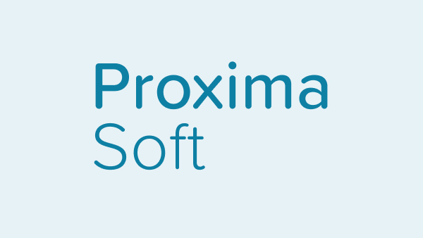
Proxima Soft
Buckholt’s default typeface is Proxima Soft.
It’s a friendly, modern typeface with rounded forms that bring warmth and approachability to digital interfaces. Its 48 styles, clarity and versatility make it ideal for creating a consistent, readable experience across a wide range of products and screen sizes.
Quicksand
As a fallback, Quicksand will be used when Proxima Soft isn’t available. It shares similar rounded forms and maintains the approachable, modern feel, helping to preserve consistency in tone and readability across different environments.
Arial
Arial is a widely supported web-safe fallback font known for its clean, modern appearance and solid legibility across screen sizes. Its simple letterforms and broad system availability make it a dependable alternative when custom fonts can’t be loaded.
Scale
Our type scale is a consistent set of font sizes used across a design system to create visual hierarchy and harmony. It ensures text elements are balanced, readable, and aligned with the overall design structure.
| 0.75 rem | Type scale 01 |
| 0.875 rem | Type scale 02 |
| 1 rem | Type scale 03 |
| 1.25 rem | Type scale 04 |
| 1.5 rem | Type scale 05 |
| 1.75 rem | Type scale 06 |
| 2 rem | Type scale 07 |
| 2.25 rem | Type scale 08 |
| 2.5 rem | Type scale 09 |
| 3.5 rem | Type scale 10 |
Weights
Font weight plays a key role in establishing emphasis and visual hierarchy in typography. While heavier weights like Semibold naturally draw more attention, size also influences hierarchy – larger light-weight text can outrank smaller bold text.
For digital experiences, we recommend using Proxima Soft in Light, Regular, Medium and Semibold weights. Semibold works well for section headers but should be avoided for long-form content to maintain readability.
Light (300)
Regular (400)
Medium (500)
Semibold (600)
Type colour
Type colour should prioritise legibility and accessibility. Keep body text neutral for readability, and reserve primary blue for primary actions.
Neutral colour for text
I’m in teal for no reason
Link
Primary blue colours are used to highlight interactive elements such as text links and primary actions.
Oops!
Something went wrong.
Coloured type can be used to convey meaning in specific contexts, such as warnings, alerts, and status messages.