Select
Select allows users to make single selections from a list of options.
Published: Last updated:
Overview
The select component allows users to choose a single option from a predefined list. It’s typically used in forms to collect input for submission.
When to use
- Use the select component within forms where users need to choose a single option from a list.
- Use in experiences that are primarily form-based or involve data submission.
When not to use
Avoid using a select component when there are fewer than three options. In such cases, response buttons provide better clarity and quicker selection.
Select versus Dropdown
Although the select and dropdown components may appear alike, they serve different purposes.
- A select displays a list of options from which users can choose only one. It’s most effective in forms where the user makes a selection and submits data.
- A dropdown shows a list of options that allow users to choose one or several items. It’s commonly used for actions like filtering, sorting, or initiating tasks within existing content.
Another key difference lies in the underlying code. The select component’s appearance is controlled by the browser, whereas the dropdown can be styled freely using custom CSS.
By default, a select component presents an empty option as the initial state, allowing users to actively choose from the list. However, depending on the use case, this behaviour can be adjusted. For example, the select can be prefilled with a placeholder (disabled option) to help give more context and direction to the user.
Size
There are two select heights available: small and medium. Supporting multiple sizes provides flexibility when structuring layouts. However, it’s important to use a consistent size for all form components on the same page. For example, if you use a medium select, use the same size for text inputs, buttons, and other elements. When in doubt, go with the default medium height.
|
Size
|
Height (px /rem)
|
Use case
|
|---|---|---|
| Small | 32 / 2 | Use when space is limited |
| Medium | 44 / 2.75 | This is the standard size and the most frequently used. If unsure, opt for the medium size |
Small select pending
Label
Concise labels help users understand what information is required.
- Use sentence-style capitalisation for all labels, except for product names and proper nouns.
- Keep labels short and concise.
- Do not use colons after label names.
Assistive / Helper text
Optional assistive and helper text provides relevant information to assist users in accurately completing a field and is often used to clarify the required data format.
Assistive text sits directly below the select label and offers support or context to the select label, whereas the helper text offers additional guidance or context for the select field, often explaining the required data format.
- Use sentence-style capitalisation, and in most cases, write the text as full sentences with punctuation.
- When used, helper text appears persistently beneath the field, except when replaced by an error or warning message.
List order
If applicable, arrange the select list alphabetically or in ascending order based on content. Otherwise, order options by frequency of use.
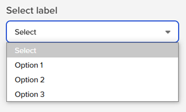
States
The select component supports multiple interactive states: resting, selected, focus, open, error, disabled, and read-only.
|
State
|
When to use
|
|---|---|
| Resting | When the select is live but not actively being interacted with, it is considered to be in its default or normal state. In this resting state, the select field should display a default value to guide the user. |
| Selected | When a user opens the list and selects an option within the list. |
| Focus | When a user tabs to or clicks on the select field, it enters the focus state, visually indicating that the component is active and ready for interaction. |
| Open | When a user opens the list. |
| Error | The error state is triggered when a required select component has not had an option selected, or when a system error occurs. This state prevents form submission until the user provides a valid response. |
| Disabled | When the user cannot interact with a component and all interactive functions have been removed. Disabled components are not focusable, are ignored by screen readers, and are exempt from visual contrast requirements, making them unsuitable when user interpretation is needed. |
| Read-only | When in a read-only state the user can review but not modify the component. Unlike a disabled state, it meets contrast requirements for readability. |
Assistive / helper text in disabled and read-only states
Text inputs in disabled and read-only states do not require assistive / helper text because users cannot modify their content, eliminating the need for guidance on data entry. In these states, any necessary context should be provided through labels or surrounding content rather than additional helper text that might imply interactivity.
Mouse
Users can open and close the select list by clicking the chevron icon or anywhere within the field. To make a selection, users can click anywhere on the desired option within the list.
Keyboard
- The dropdown field is the element that receives focus, and all keyboard interactions originate from it.
- Users can open the list using
Space,Enter, or theUp/Downarrow keys. - Pressing the
Down arrowmoves the highlight to the next option in the list. - Pressing the
Up arrowmoves the highlight to the previous option. - Pressing
Escape,Space, orEnterwill close the list.
Validation
Select input data should be validated upon form submission. For comprehensive guidance on errors and validation, refer to the form pattern.
Validation messages take precedence over helper text and will replace it when triggered. If an input displays helper text, it will be hidden in favour of the validation message when an error state occurs.
Error
An error state is triggered when invalid data is entered or a required field is left empty. It is visually indicated by a red border, and an error message with error icon to help users identify and correct the issue.
Since the select input doesn’t display an error icon, one is included at the beginning of the error message to improve visibility and help draw the user’s attention.