Button
A button triggers an action or event and lets users know what to expect next.
Published: Last updated:
Overview
Buttons are interactive elements that initiate actions. They serve as clear calls to action, enabling users to engage with a page in various ways. Labels indicate the specific action that will occur upon interaction.
When to use
Buttons should clearly communicate actions users can take and facilitate interaction with the page. Each page should have only one primary call to action, while all other calls to action should use lower-emphasis buttons.
When not to use
Button should not be used as navigational elements. Instead, use a link when intending to take users to a new page.
Variants
Each button variant serves a particular function, communicated through its design. To ensure clarity and consistency, use each variant appropriately across products, reinforcing the correct calls to action.
|
Button style
|
Purpose
|
|---|---|
| Primary | High-emphasis: the principle call to action on a page. Primary buttons should only appear once per screen, excluding page header, modal dialogs or side panels. |
| Secondary | Medium-emphasis: used for the secondary actions on a page. Sometimes used in conjunction with a primary button in a button group to perform lower tiered actions. Can be used in isolation and for lower importance actions. |
| Ghost | Low-emphasis: use for the least pronounced actions, and most often used in conjunction with a primary button to only perform a negative / destructive action, such as ‘Cancel’ or ‘Delete’. The ghost button may be grouped with a primary and secondary button in a situation such as a page flow, where the primary is for ‘Continue’, secondary is for ‘Add’ and ghost is for ‘Cancel’. Ghost buttons are effective together as a group of icon buttons, such as actions in a table row. |
| Danger | Use for actions that could have destructive effects on a user’s data, such as delete or remove. The danger button is available in three styles: primary, secondary, and ghost. |
Size
The button is available in three sizes: small, medium and large. The table below adds more context around the use case for each size.
|
Button size
|
Use case
|
|---|---|
| Small | Use when vertical space is limited or in areas with a confined layout. |
| Medium | This is the most common size for buttons used throughout the UI. |
| Large | Used when more emphasis is needed for a button such as when used at the bottom of a form. |
Emphasis
Button order doesn’t always have to follow the sequence implied by their labels. While secondary buttons have less visual prominence than primary buttons, they still carry some weight due to their style. For layouts requiring multiple actions, low-emphasis buttons (ghost) may be a better choice.
The best practice is to establish and keep a clear visual hierarchy among buttons in your UI.
A single, high-emphasis button
A layout should typically feature only one high-emphasis button, ensuring a clear visual hierarchy. This button stands out as the most important action, drawing the most attention while signaling that other buttons hold less priority.
Multiple button emphasis
A high-emphasis button can also be paired with medium and low-emphasis buttons for less critical actions. However, only group calls to action that are contextually related to maintain clarity and usability.
Use high-emphasis and medium-emphasis buttons together within a button set.
Don’t use multiple high-emphasis buttons within a button set.
Alignment
Alignment refers to whether buttons are positioned to the left or right within a window, container, or layout. Unlike other components, button alignment is flexible, depending on their placement and whether they are contained within another component..
In general, on full-page layouts, the primary button is typically placed on the left side of the page. When users scroll through content, positioning the button where their attention is naturally focused enhances usability. However, in components such as modals, the primary action is traditionally placed at the bottom right. Similarly, buttons within components like notifications, search fields, and data tables are usually right-aligned for consistency.
In some cases, such as in short forms or on smaller screens, single buttons may span the entire width of the window to container and button sets will stack their buttons.

Alignment of buttons across various patterns & layouts.
|
Alignment
|
Use case
|
|---|---|
| Left | Default button alignment: forms, cards |
| Right | Modals, data rows, repeat groups |
| Full width | Short forms, small device screens |
Button sets
Button sets help align related actions, ensuring a logical and organised layout. Buttons are grouped based on their function and importance, avoiding too many calls to action that could overwhelm users.
As noted in the Emphasis section, the button order doesn’t have to follow what their labels may imply. Secondary or ghost buttons can be grouped with a primary button. However, due to the visual weight of secondary buttons, it’s best to use ghost buttons in layouts with more than three calls to action.
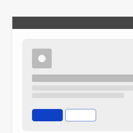
Do use a primary and two of the same lower emphasis buttons in a button set.
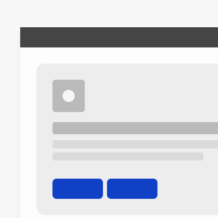
Do not mix icon-only buttons with any other type of button in the same button set.
Aligning buttons in sets
When using multiple buttons, the primary button’s position should follow the alignment guidelines above. In full-page layouts, the primary button is left-aligned and placed to the left of secondary or ghost buttons. In other layouts where the buttons are right-aligned, the primary button is positioned to the right of secondary or ghost buttons.
Button label
A button’s label is its most important element, clearly indicating the action it performs. Buttons should always be clear and predictable to ensure a seamless user experience.
Button labels should clearly convey the intended action. Use the {verb} + {noun} formula for clarity, except for common actions like ‘Done,’ ‘Close,’ ‘Cancel,’ ‘Add,’ or ‘Delete,’ where a single word is sufficient.
While the {verb} + {noun} formula is best practice, exceptions can be made in compact UIs where long button labels could cause layout issues or impact translations.
Buttons uses sentence case for all labels.
Do use the {verb} + {noun} content formula in buttons whenever possible.
Do not use only a noun as a button label.
Overflow content
If a button label exceeds the available space, it should wrap to a second line rather than being truncated. Truncating button labels can reduce clarity and hinder usability.
As a best practice, button labels should remain on a single line to maintain clarity and visual balance. Wrapping to a second line should be a last resort. Use the {verb} + {noun} formula to keep labels concise and meaningful. If space is limited, consider shortening words (e.g., “document” to “doc”) or using symbols (such as “&”) — as long as the label remains clear and understandable.
Do wrap the button label to a second line if there’s overflow content.
Do not truncate the label of a button if there’s insufficient space inside the button.
Primary button focus
The primary button represents the default action. In modals, it typically receives focus by default. On forms, if the focused component isn’t actionable with the Enter key, pressing Enter will trigger the primary button.
Primary button
The primary button serves as the main call to action on a page and should appear only once per screen, with exceptions applying to temporary flows with primary actions. The primary button helps guide user focus and provides clear context for the expected next step.
Secondary button
As noted in the Emphasis section, secondary buttons have a less visual prominence than primary buttons, but more prominence that ghost buttons. They are designed to complement a primary button and, when paired, typically perform additional contextual actions. Secondary buttons are effective both on their own or when included in a button set.
Secondary buttons for page headers
Using a primary button in a page header can be problematic, as the content below the header likely has or will have a primary action. Even if the button in the header isn’t styled as primary, its placement at the top gives it significant prominence. Therefore, it’s recommended to use a secondary button for page headers.
If it’s decided that the button in the page header should be primary across all tabs, ensure that no content below the header contains another primary action.
Secondary buttons in button sets
In button sets where there is one primary action and two other actions of equal importance, consider using secondary buttons for the secondary actions.
Ghost button
Ghost buttons have the least prominence among button variants. Their subtle design makes them ideal for supplementary actions. They work best when coupled with primary actions (as the opposing negative action, such as ‘Cancel’ or ‘Delete’), aligned with a container or grouped with other elements.
Ghost buttons for data table actions
Buttons in a data table toolbar are often styled as primary buttons, but this may not always be appropriate. If another button on the page requires primary styling, consider using a ghost button instead.
Ghost button used as a cancel action
Ghost buttons are effective as cancel buttons in progressive flows, as their subtle design requires users to deliberately find and click them to cancel.
Danger button
Danger buttons are used for actions that may have destructive consequences, such as Delete, Remove, or Stop.
There are three danger button styles: primary, secondary, and ghost. The appropriate style depends on how prominent the destructive action should be. Use the primary danger button when the destructive action is the main or required step in a workflow. If the action is optional or one of several choices, a lower-emphasis style such as secondary or ghost may be more suitable.

Icons in buttons
Icons can be used alongside labels to clarify an action and draw attention to a button. However, they should be used sparingly to avoid visual clutter and maintain usability. Just because you use an icon with one button in your UI doesn’t mean all buttons need to include icons.
- Icons should match the font size of the label
- Icons should always appear to the left of the label
- Icons used in buttons should be directly related to the action the user is performing
- Icons must match the colour of the label within the button
Do place the icon on the left of the button before the label
Do not place the icon on the right of the button after the label
Common actions with widely recognised icons
When deciding whether to add an icon to a button, consider the recognisability of the icon and whether it may be used for a different meaning in other contexts. It’s important to avoid using the same icon for completely different actions.
To address this, a set of common actions has been defined with clearly recognised icons that are suitable for use alongside button labels.
Icons outside this set can still be used, as long as they clearly convey the intended action. To ensure proper usage, check the icon’s name in the icon library.
|
Name of action
|
Icon
|
Name in icon library
|
|---|---|---|
| Add | Plus | |
| Copy | Copy | |
| Delete | Bin | |
| Download | Download | |
| Edit | Edit | |
| External link | External-link | |
| Logout | Logout | |
| Save | Save | |
| Search | Search | |
| Settings | Settings | |
| Upload | Upload |
Avoid using a predefined icon to represent a different common action
Repurposing icons from the defined list for other actions can create confusion and disrupt the expected user experience.
Maintain consistency in icon usage for buttons within a button group
Icons in button sets are optional, but for consistency, either all buttons should include icons or none should. Icons can enhance clarity by visually representing an action and drawing attention, but excessive use may create visual clutter and complicate the experience.
Only use icons in button sets for common actions listed in the table above or for actions where a specific icon is commonly recognised and associated.
Do ensure a consistent approach to icon usage across button sets.
Do ensure a consistent approach to icon usage across button sets.
Avoid using icons for only a few buttons within the same button set; maintain consistency across all buttons.
Avoid using icons for only a few buttons within the same button set; maintain consistency across all buttons.
Use the default variation for all icons
The icon library includes filled variants for some icons, but since not all icons have this option, the default version should be used for consistency. The only exception is status icons, which have predefined variants. Default icons are named according to their action.
Icon-only buttons
Icon-only buttons enable users to take actions and make choices with a single click. They can be styled as primary, secondary, or ghost variants, though they are most commonly primary or ghost buttons. Icon-only buttons are limited to medium and small sizes only.
Use icon-only buttons sparingly to maintain clarity and avoid visual clutter, for example, when space constraints within a component prevent the inclusion of labels. However, to maintain clarity and accessibility, icons should be labelled elsewhere in the interface. “For most situations, users learn correct interpretations better with text alone than with icons alone.” — Wiedenbeck, S (1999).
For this reason, icon-only buttons are best suited for the following use cases:
- The icon should be standardised and easily recognisable without a label or should visually represent the action clearly, such as a save icon for saving
- When space is limited and multiple actions are needed, using a toolbar with icon buttons is recommended

Example of icon-only ghost buttons just in a Versa-tile.
Tooltips for icon-only buttons
Regardless of how recognisable an icon is or whether it belongs to the Common actions list, a tooltip is always required to provide text explaining the button’s action when clicked.