Summary-meta
Groups an icon with short text to show key info clearly and quickly.
Published: Last updated:
Overview
Summary Meta is a flexible composition component used to present key contextual information at a glance. It pairs an icon block with supporting text elements, such as headings, labels, body text, or key–value pairs, to create a clear, scannable summary. The content included can vary based on context, allowing the component to adapt to different use cases while maintaining a consistent structure and visual hierarchy.
When to use
- To summarise key information alongside a visual cue, such as an icon
- When combining an icon block with short, related content like labels, headings, or key–value pairs
- To highlight important details without overwhelming the page layout
- In dashboards, summaries, confirmation views, or overview sections
When not to use
- For long-form or detailed content that requires full paragraphs or complex layouts
- When the icon does not add meaningful context or clarity to the information
- As a replacement for primary content or full page sections
Content
The default Summary Meta is designed to contain three lines of content to align with the 80px (5rem) icon block height. This typically includes a heading and two supporting content types, such as a label, key–value pair, or body text. Other components may also be suitable depending on context as well as other combinations using different icon block sizes.
Content in the Summary Meta component should be clear, concise, and easy to scan. Use only the essential text needed to convey meaning, keeping labels, headers, and values short and on a single line whenever possible. Avoid line breaks or verbose descriptions to maintain clarity, save space, and ensure the component remains readable at a glance.
Stacked summary meta
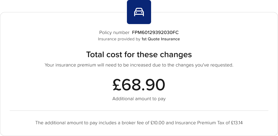
The stacked variant arranges the icon and content vertically instead of horizontally. This layout works well when space is narrow or when a clearer separation between the icon and text is needed. It can also help draw focus to the summary, for example when placed in the centre of a card, while maintaining the same concise, scan-friendly approach to content as the standard Summary Meta.