Breadcrumb
Breadcrumbs show where a page sits in the site and let users go back with ease.
Published: Last updated:
Overview
Breadcrumbs indicate a user’s current position within the site structure and allow them to move quickly to a parent level or previous step.
When to use
Breadcrumbs are effective in products and experiences with extensive content organized across multiple hierarchical levels. They take up little space while still providing users with clear context about their position within the navigation structure.
When not to use
Breadcrumbs are a secondary navigation aid and should not replace the primary navigation. They aren’t suitable for products with a single-level structure, as they add unnecessary clutter.
Types
Buckholt offers two types of breadcrumb that share the same visual style but differ in how the breadcrumb trail is generated. The chosen type should remain consistent throughout a product.
|
Breadcrumb type
|
Purpose
|
|---|---|
| Location-based | These represent the site’s hierarchy and indicate the user’s current position within it. |
| Path-based | These show the specific steps a user followed to reach the current page, rather than reflecting the site’s overall structure. Path-based breadcrumbs are always generated dynamically. |
Placement
Breadcrumbs are positioned in the top-left area of the page, below the header and primary navigation, but above the page title.
Page link
- Each page link should be brief and clearly represent the location or item it leads to.
- The breadcrumb trail begins with the highest-level parent page and moves deeper into the site hierarchy.
- The current page is not included by default. If a page has no title or the user’s current location is unclear, it may be added when appropriate. When included, it appears last in the trail and is shown as non-interactive text.
Overflow content
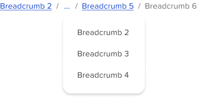
When space is limited, use an overflow menu to shorten the breadcrumb trail. The first and last two page links should remain visible, while the pages in between are grouped into an overflow menu. Breadcrumbs should not wrap onto a second line.
Truncation
For most situations on larger breakpoints, keep the first “Home” breadcrumb visible for as long as possible, even when an overflow menu is used. On mobile or smaller viewports, begin with the overflow menu followed by a single visible breadcrumb.
Interactions
All pages in the breadcrumb component should be interactive, except for the current page, and should link to their respective destinations.
Mouse
Users can activate a breadcrumb by clicking its page link. Separators between links are not interactive.
Keyboard
Users can move through breadcrumb links using Tab and Shift + Tab. A link can be activated by pressing Enter when it has focus. For more keyboard interactions, refer to the accessibility guidelines.
Modifiers
By default, breadcrumb trails should not display the current page. If a page lacks a title or the user’s current location is unclear, the current page may be included. When it appears in the trail, it is always placed last and is shown as non-interactive text.