Text block
A text block displays text, with the ability to include header and icon elements.
Published: Last updated:
Overview
Text blocks are versatile components designed to present a wide range of written content, typically in paragraphs. They can include headings, paragraphs, eyebrows, and even icons to support different content needs.
Text blocks are highly flexible and must include at least a heading or paragraph, or both. Additionally, an eyebrow and/or icon can be included to enhance the content and provide extra context or visual support.
When to use
- To display any main body text such a full sentence or paragraph.
- To display headings for page layouts or sections.
- The text is explanatory, descriptive, or instructional.
When not to use
Do not use text block as a label, helper text, or any text element intended to be interactive.
Supported elements
Text blocks are composed of four elements: a heading, paragraph text, an eyebrow, and an icon. Each element can be used only once inside a text block, with the body text being split into paragraphs if necessary.
|
Element
|
Purpose
|
|---|---|
| Heading | Provides a clear and scannable title for the content. |
| Body text | The main body content, with longer copy split into paragraphs. |
| Eyebrow | A short piece of text that sits above the heading, offering additional context about the section or content that follows. |
| Icon / icon block | Visual support for the follow content. |
Heading text
In hac habitasse platea dictumst. Pellentesque habitant morbi tristique senectus et netus.
Nam eu nunc non augue tincidunt suscipit. Suspendisse potenti. Aliquam erat volutpat. Integer vel turpis sed purus scelerisque euismod.
How to make perfect morning coffee
Making the perfect cup of coffee starts with the right technique. Follow these simple steps to brew a delicious, flavourful cup every time.
Why dogs make the best pets
Dogs are loyal, loving, and always ready to brighten your day. Whether you’re taking them on a walk or cuddling up at home, their companionship brings comfort and joy to any household.
The mystery of haunted houses
Haunted houses have long been the subject of eerie legends and chilling encounters. From strange noises to ghostly apparitions, these places are shrouded in mystery.
Heading
The heading serves as the title or focal point of the content. It provides structure and helps users quickly understand the subject matter or topic being presented. The heading is the most prominent element in the text block, establishing the content’s hierarchy and acting as a guide for the reader.
Headings should only be used once within a text block. They should be clear and concise, providing enough context to support quick readability when used alongside body text.
- Use sentence-style capitalisation for all headings, except for product names and proper nouns.
- Keep headings short and concise, and no more than 2 lines.
Body text
Body text is the core content of a text block and should be clear, readable, and well-structured for easy scanning.
Body text follows the heading and provides depth to the subject introduced. It should be concise and broken into paragraphs for better readability. Avoid long blocks of text to prevent overwhelming the reader.
Eyebrow
Eyebrow text appears above the heading and acts as a subtle label or category for the content within a text block. It provides quick, high-level context, helping users understand what type of content to expect before reading the heading.
Eyebrow text should be short and typically one to three words. It’s especially helpful when grouping similar content types or when additional categorisation is needed. Only one eyebrow should be used per text block.
- Use sentence-style capitalisation, except for product names and proper nouns.
- Keep eyebrow text short and concise, and no more than three words.
- Eyebrow text should only be used in combination with a heading and never appear on their own.
- Eyebrow text may be used alongside a heading that includes an inline icon, but it should not be used with an icon block.
Inline icons
Inline icons can help enhance meaning, reinforce the tone, or draw attention to the message. When used thoughtfully, they act as visual shorthand, helping users quickly interpret the type or urgency of the content.
Inline icons should:
- Be simple and easily recognisable.
- Support, not replace, the heading text.
- Always appear to the left of the heading.
- Align with the tone and purpose of the content (e.g. an info icon for guidance, a warning icon for alerts).
- Be used with a heading and with or without eyebrow text.
- Inherit the text size of the heading.
Avoid decorative icons that do not convey meaning, and don’t use multiple icons within the same heading. An icon should add value, not distraction.
Planning you next road trip
Whether you’re heading to the coast or exploring countryside backroads, these tips will help ensure your drive is smooth, safe, and stress-free.
Icon blocks
Icon blocks are icons placed at the top of a text block, above all other elements. They designed to grab attention, establish tone, provide context or categorisation and visually differentiate the block from surrounding content.
- Use icon blocks to highlight content.
- Use icon blocks help users quickly scan and identify sections.
- Use icon blocks to provide context or categorisation.
- The icon should be relevant and support the meaning of the content.
- Do not combine icon blocks with inline icons in the same component.
- Icon blocks cannot appear with eyebrow text, and must be followed by a heading.
Icon block sizes
Text blocks use two icon block sizes: medium and extra large. Headings styled as title are paired with the default size, medium icon block, while headline-styled headings are paired with the extra large icon block.
Where to locate us
Use our locator tool to find the closest authorised service centre in your area. Results include contact details, opening hours, and directions.
Icons blocks and display headings
Unlike inline icons, icon blocks are not used with display-sized to avoid competing focal points, ensuring the heading remains the primary visual emphasis.

Use only inline icons with display sized headings.
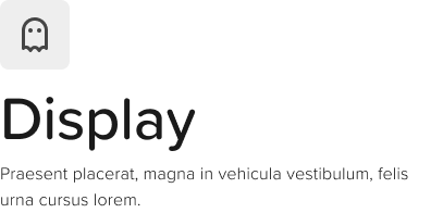
Don’t use icon blocks with display sized headings.